Generate Poster Blog
10 AI Poster Design Tips for Beginners
2024-12-10
Whether you're creating event flyers, movie posters, or gift prints, the difference between a generic output and something worth sharing usually comes down to a handful of consistent habits. Here are ten that actually matter.
1. Master the Art of Prompting
Your prompt is the foundation of every design. Be specific but not overwhelming:
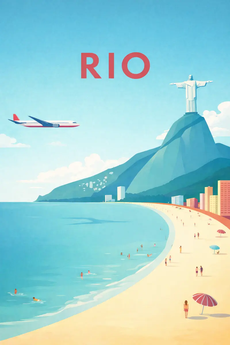
Good: "A retro 1970s travel poster of Tokyo at sunset, bold geometric shapes, limited color palette"
Too vague: "A poster about Japan"
Too complex: "A photorealistic hyper-detailed poster showing every street in Tokyo with thousands of people walking around at golden hour with cherry blossoms falling..."
2. Understand Style Keywords
Certain keywords consistently produce specific aesthetics:
- Minimalist - Clean, simple, lots of white space
- Vintage - Aged textures, muted colors, retro typography
- Psychedelic - Vibrant colors, swirling patterns, 60s influence
- Art Deco - Geometric shapes, gold accents, elegant symmetry
- Bauhaus - Primary colors, simple shapes, modernist design
3. Consider Your Color Palette
Colors set the emotional tone:
- Warm colors (red, orange, yellow) - Energy, excitement, urgency
- Cool colors (blue, green, purple) - Calm, trust, sophistication
- Monochromatic - Elegance, focus, modern feel
- High contrast - Drama, impact, attention-grabbing
4. Think About Composition
Even with AI, composition matters:
- Leave space for text elements
- Consider the rule of thirds
- Think about visual hierarchy
- Plan for where eyes will naturally travel
5. Use Reference Images Wisely
When uploading reference images:
- Choose images with clear style characteristics
- Avoid copyrighted material for commercial use
- Multiple references can confuse the AI
- Higher quality references yield better results
6. Iterate and Refine
Don't expect perfection on the first try:
- Generate initial concepts
- Identify what works and what doesn't
- Refine your prompt based on results
- Generate new variations
- Repeat until satisfied
7. Match Style to Purpose
Different purposes need different approaches:
| Purpose | Recommended Style |
|---|---|
| Concert poster | Bold, energetic, high contrast |
| Corporate event | Clean, professional, minimal |
| Art exhibition | Artistic, unique, thought-provoking |
| Travel promotion | Inspiring, colorful, scenic |
| Movie poster | Cinematic, dramatic, star-focused |
8. Pay Attention to Aspect Ratios
Choose the right dimensions for your use case:
- Portrait (2:3) - Traditional posters, movie posters
- Square (1:1) - Social media, album covers
- Landscape (3:2) - Banners, headers
- Wide (16:9) - Digital displays, presentations
9. Diagnose Before You Regenerate
When a result misses, resist the instinct to just try again with the same prompt. Instead, identify which layer is off:
- Wrong mood — the lighting or atmosphere does not match the intent. Add or replace mood words before regenerating.
- Wrong composition — the focal point is unclear or the subject is poorly placed. Specify "central portrait", "rule of thirds", or "negative space for title" explicitly.
- Style drift — the output blends aesthetics you did not intend. Reduce style keywords to one clear direction.
- Identity lost — if you uploaded a photo and the face drifted, simplify the scene description and let the uploaded image do more of the work.
One targeted change per iteration teaches you more than starting over.
10. Build a Prompt Library
Save your successful prompts for future reference:
- Organize by style or purpose
- Note what worked well
- Create templates for common needs
- Share with your team
Bonus: Break One Rule Deliberately
Once you have a direction that is working, try pushing one element further than feels comfortable — a much darker palette, an unexpected crop, a style that contrasts with the subject. The best poster in a batch is often the one that surprised you.
Start generating now and apply whichever of these tips feels most relevant to your first prompt.