Generate Poster Blog
How to Create Movie Posters with AI (No Photo Needed)
2024-12-15
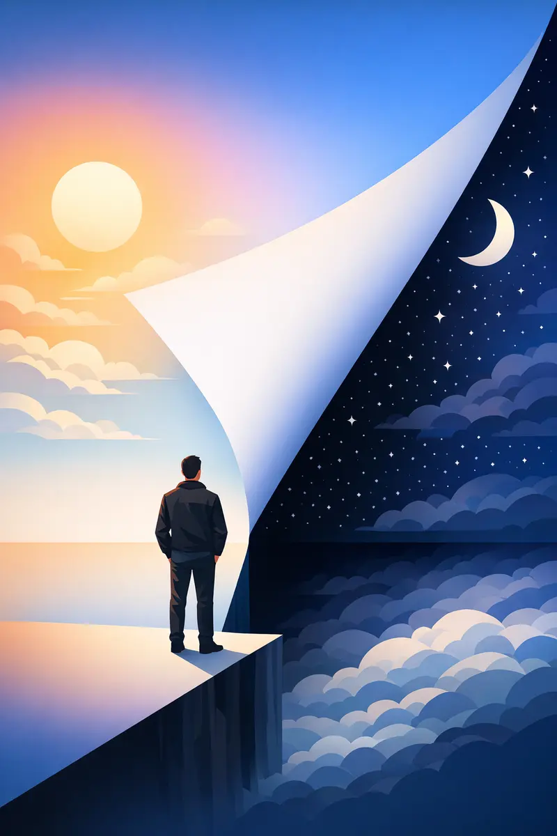
This guide covers how to create movie posters with AI starting from nothing but a written idea — a film that does not exist, with no photo upload, no scanned artwork and no design software. You describe a scene, choose one visual direction, and the generator renders the poster.
That scope is deliberate. If what you actually want is your own face on the poster, that is a different workflow with different rules, and how to turn your photo into a movie poster covers it properly. Everything below assumes the poster is invented from words.
Concept posters are the harder half of the job, because the model has nothing to anchor to except your description. Get the description right and the results are strikingly good. Get it vague and you get the same soft, over-lit, weightless image everyone else gets. You can follow along in the movie poster generator while you read.
What makes a poster read as a movie poster?
A movie poster is not just a nice picture in portrait format. It is a piece of design built to be understood from across a room, and it almost always does four things at once:
- One focal idea. A single figure, object or silhouette owns the frame. Everything else is atmosphere.
- Light does the acting. Genre lives in the lighting far more than in the subject. Hard side light reads as a thriller; flat, warm light reads as a comedy; a single cold source in a dark frame reads as horror.
- A restrained palette. Most posters run on two colours and a neutral. Teal and orange, amber over black, bone white against dusty red.
- Designed empty space. The bottom third is usually quiet on purpose, so type has somewhere to live.
The last one is the one people skip, and it is the reason a technically impressive image can still feel wrong. If your description does not ask for an area to breathe, the model will happily fill every pixel.
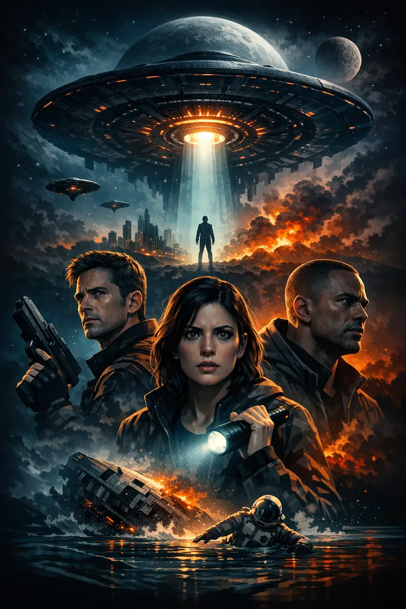
How to create movie posters with AI, step by step
The wizard runs in four steps — Concept, Style, Images, Review. Here is what each one is for when you are working from an idea rather than a photo.
- Concept. Pick the custom option, which builds the poster from scratch. The other two paths start from a curated template or from a poster you upload; neither is what you want when the whole point is an original idea.
- Style. Choose one style from the grid. For a cinematic look, the movie style is the obvious start; vintage and retro pull towards print-era poster art, and monochrome towards noir. Choose one and commit to it.
- Images. This step is labelled Images, but on the custom path it is where your poster description goes — the photo upload beside it is optional and you can simply leave it empty. Write the description here and continue with no photo at all.
- Review. You get a summary of your concept, style and description before anything is generated. There is a short countdown that starts the run automatically, with a stop button if you want another read of your description first.
Then it generates. A run usually takes a minute or two rather than an instant, and credits are only deducted when a poster actually comes back. Posters come out in the standard 2:3 portrait shape, the same proportion as a cinema one-sheet, so you do not need to work that out yourself.
What should you write in the poster description?
A strong poster description covers six things: the subject and what they are doing, the genre and era, the light, the palette, the camera angle, and where you want empty space. Miss the light and the space, and you get a stock image in portrait format.
Work through them in that order:
- Subject and situation —
a lone diver, nota person. Give them an action or a posture. - Genre and era —
1970s crime drama,1950s desert western,near-future sci-fi thriller. Era does a huge amount of work on grain, colour and type styling. - Light — name the source and its direction.
hard side light,shafts of green light from above,a single street lamp behind the subject. - Palette — two colours and a neutral is plenty.
warm amber over near-black. - Camera angle —
low angle,wide establishing shot,tight portrait crop. - Empty space —
wide empty water across the top third,generous dark space along the bottom.
Three worked examples you can adapt:
A lone diver silhouetted against a flooded cathedral, shafts of green light falling from above, deep teal and cold silver palette, low camera angle, wide empty water across the top third
1970s crime drama poster, three faces stacked in a vertical column, hard side light, warm amber over near-black, heavy film grain, generous dark space along the bottom
Desaturated noir poster, a rain-lit street seen from behind a single figure under a lamppost, near-monochrome with one cold blue accent, high contrast, empty sky for a title block
Notice what is missing from all three: adjective pile-ups. Epic, stunning, masterpiece, 8k and highly detailed do almost nothing, because they describe your opinion of the result rather than the image itself. Specific nouns and light beat intensifiers every time.
When a result is close but not right, change one variable and run it again. Swap the light direction, or the palette, or the angle — one of them, not all three. That is how you learn which lever actually moves the image. For a wider set of prompt habits, 10 AI poster design tips for beginners goes deeper on the fundamentals.
Which style should you choose for a movie poster?
The style you pick sets the rendering language before your description is even read, so it is worth matching it to the genre rather than defaulting every time. Rough mapping:
- Movie — photographic, cinematic realism. The default for thrillers, dramas, sci-fi and action.
- Vintage or retro — aged palettes, print texture, mid-century poster art. Good for period pieces and for anything that should feel hand-made.
- Monochrome — noir, tension, one strong accent colour if you ask for it.
- Art deco — 1920s and 1930s period work, geometric and ornamental.
- Cyberpunk — neon, wet streets, high-contrast night cities.
- Minimalist — one symbolic idea and a lot of space. Very unforgiving of a weak concept, and superb when the concept is strong.
- Auto — if you genuinely do not know, this lets the art direction follow your subject.
One style per poster. If you love two directions, generate them separately and compare — that is faster and cleaner than trying to wrestle a single overloaded description into shape.
Can AI put the title and credits on your poster?
Not reliably, and there is no field where you type your title. Anything that looks like lettering has been drawn by the image model along with everything else, which means words can come back misspelled, letters can be invented, and small credit blocks tend to dissolve into texture that only looks like type from a distance.
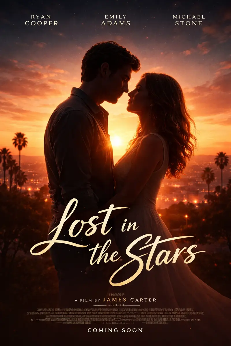
There are two sane approaches:
- Design for type, then set it yourself. Ask for a clean, low-detail area —
generous dark space along the bottom third— and add the real title in any editor afterwards. This is what you want for anything you are printing or gifting. - Treat lettering as texture. If you like the look of model-drawn type, keep any words short and read every letter at full size before you commit. Long taglines and credit blocks are where it falls apart.
Either way, check the spelling on the download rather than on the thumbnail.
Why do AI movie posters look generic — and how to fix it
Five failure modes cover most disappointing results:
- The prompt lists objects instead of describing light. A spaceship, a city and a hero is a shopping list. Name one light source and the image gains structure immediately.
- Too many subjects. Three characters, a vehicle and a skyline compete for the same focal point and none of them win.
- Style mixing. Asking for minimalist and photorealistic and retro in one run gives you a muddle of all three.
- No negative space requested. The frame fills edge to edge, and there is nowhere for a title to sit.
- Over-describing. Past a point, extra clauses dilute the important ones. Cut back to the six ingredients above.
If your results still feel flat after fixing those, the issue may be the model rather than the prompt — what makes the best AI poster generator for cinematic posters breaks down what separates cinematic output from generic AI art.
Should you upload a poster you like as a style reference?
No — not a released cinema poster, anyway. This is worth being blunt about, because it used to be common advice, including in an earlier version of this article.
Image models reproduce what you show them. Feed one a real poster and the layout is not all that carries across: the studio wordmark, the tagline, the billing block and the copyright line along the bottom can survive into your download too. You end up with someone else's trademarks baked into an image you cannot use, and you may not notice until you have printed it.
Describe the aesthetic instead. Era, lighting, palette, composition and type styling are not owned by anyone — 1970s crime drama, hard side light, amber over black, faces stacked vertically gets you the visual language with none of the artwork. Classic mafia poster prompts shows this pattern in detail for one genre, and the same approach transfers to any of them.
If you do use the upload path for a poster style, use artwork you made or own the rights to. And if you are recreating a favourite film, recreate its look, never its title, logo or cast.
Start creating your movie posters
Concept posters reward precision, not volume. Write one description that names a subject, a light source, two colours, an angle and a piece of empty space, pick a single style, and generate. Read the result, change one thing, and go again. Two or three considered runs will beat a dozen scattershot ones.
When you are ready, open the movie poster generator, choose the custom concept, and turn the film in your head into something you can hang on a wall.